
About the Content
Beats is one of the most recognized names in music, known to have created some of the best headphones and speakers that money can buy. Despite this however, their website looked rather bland, and I took the challenge up of re-designing it to better appeal to their brand and customers. I focused on strong navigation, consistency, and heightened designed options to take their website to the next level.
The Current Website
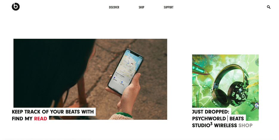
This is currently Beats’ homepage on their website. While not poor by any means, to me the site looked a little boring. I understand the use of white space, as it makes the images pop and gives the site more of a modern feel, but personally, I found this to be visually unappealing, and giving the opposite feel of the loud, trailblazing identity that Beats has built for itself. I’m all for using white space, but Beats’ website consisted almost entirely of images and words randomly dropped on the page. It felt like it had no structure. Not just that but it was incredibly difficult to find anything on the site. For starters, Beats has a staff consisting of some incredibly talented writers who author some amazing pieces about the crossroads between race and music. This is a valuable tool to have, as not many headphones or electronic companies can say that they have staff writers. Unfortunately, their articles were difficult to find on the Beats’ website.
Site Map
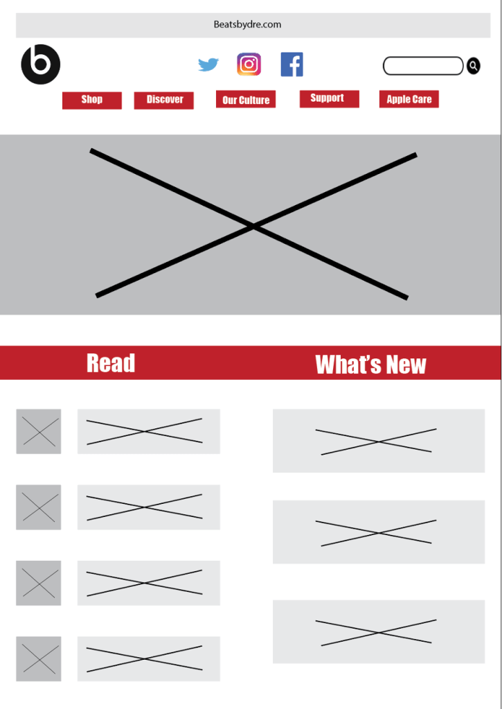
This is my reconfiguration of Beats’ website. I really wanted to focus on removing white space while simultaneously making it easier to navigate. To start, I decided to keep the logo and the search bar at the top of the page. Not only does it look good aesthetically, but it also lets the user know who Beats is (if they only recognize the company logo and not the name), and also provides them with an opportunity to search for what they are looking for if they don’t feel like looking through the tabs. I also added social media links at the top of the page to better increase traffic to Beats respective social media accounts.
From there Beats has their five tabs listed out which should easily allow users to access exactly what they are looking for.
Below the tabs I added a space for a large picture to go. I plan on having this be a rotating picture of Beats products that changes every few seconds or so. When the product that is depicted in the photo is clicked on, it will take the user directly to that item to purchase. I think that it would be a great idea to showcase new items here as well as items that are on sale.
Under the photos I have two columns. The first of the two is where Beats will have their most recent articles posted. While users can already find articles under the “Read” option located under the “Discover Tab”, I really want to showcase some of this work on Beats’ homepage because it is something that is so incredibly unique and valuable to the company. This will give users another reason to access the Beats site rather than just purchasing Beats products. The right column will be where Beats showcases their new items. While again, there is already an option to access Beats’ new items under the “Discover” tab, I want to showcase Beats’ new products and news on their homepage so users always know what is going on.
Wireframe

Currently, Beats’ website only has three tabs in their header. For a company with as much content and products as Beats does, I decided to tidy up the tabs while also adding a few extra ones. For starters, Beats should have a drop-down tab under the “Shop” tap when the users mouse hovers over it. As of right now, when the user clicks on the “Shop” tab, it brings them to a new page where they can they choose to shop between headphones, earphones, and speakers. This seems rather unnecessary, as it would make more sense to both Beats and the shopper to skip this step and have the option to select exactly what it is that they’re looking for by using a drop-down bar.
As of right now, the “Discover” tab on Beats’ website links you back to the homepage, which I am not a fan of. To me, a discover page should include content about your company that you couldn’t find on your homepage – if it is a homepage simply call it that. I want to change this, and I made the “Discover” tag drop down to give the user a few different options as to what exactly it is that they want to discover. The “What’s New” tab would open to a new page and contain information about everything new that’s going on at Beats – whether it be new products, new advertisements, or even new sponsored athletes. Beats has some incredible deals with professional athletes who wear their products and Beats should be capitalizing on that. This is also where I added a tab that links users to the staff articles which they can find under the “Read” tab, making them much easier to find than it currently is on their website. Beats has found its way into pop culture, with music and sports fans alike taking some incredible images while wearing or using Beats products. Beats should allow users to submit these photos to share on their website, which can be found under the “Photo Submissions” tab. Lastly, Beats should also include an “Offers” tab as a place to store coupons, deals, and sale information.
As noted before, Beats has an extremely strong culture that is linked to athletics and music, and they should emphasize that on their site. That is why when referring to themselves, Beats should refer to it as their culture, or in this case, “Our Culture”. When hovering over this tab, the first option to appear is “Our Start”. I want this to link users to a new page that details how Beats started, and how Dr. Dre began his music empire. The next tab will say “Our Vision”, and the corresponding page will detail how Beats has changed the music scene and go into greater detail about the work and effort that they put into their product. The last tab will have career offers and opportunities for anyone looking to work for Beats.
It’s important that users are able to find assistance when they need it, which is why I want to add a “Support” tab as well. Here users can find frequently asked questions, information about product warranty, and can also find user guides on all of Beats products.
Also, not a lot of people know that Beats is now owned by Apple, which thus allows consumers to use Apple Care. By putting this in the header along with a link to Apple’s website, we are informing users about the two companies’ relationship as well as providing them with information if they wanted to purchase Apple Care for their Beats products. I also added links to Beats’ social media accounts to help engage with their community and gain new followers across all platforms.
Color Palette

For these colors, I really wanted to use pastel shades that are unique to Beats. For starters, I had to include black because it has always been Beats’ primary color. Their logo and best-selling pair of headphones are both the color black, so it makes sense to continue using that as a primary color.
Next up I chose red. Beats has always been black and red – their original logo depicted the two colors, so I really wanted to continue that theme. I did decide to change the shade of the color red however, as now it is more of a pastel, much like the three remaining colors.
I wanted to use colors that are representative of the Beats brand, and I feel like the yellow and blue do just that. I settled on these two respective colors after poking through Beats’ website and seeing these two shades being used for Beats’ newest pair of earbuds. I also decided to make them a softer pastel color because they are easier on the eyes and also look a bit like the matte finish that you can find on Beats products.
Lastly, I wanted to use a light color to offset the other four options that I chose but I didn’t want it to be plain white. I ended up choosing this shade called “Antique White” because while still being light in nature, its unique enough where it stands out, much like the other colors that I chose. All in all, Beats is an incredibly successful company whose website could use a little fine tuning. I am confident that in implementing my changes, Beats’ website will not only be visually appealing, but easy to navigate as well, both meeting my personal goals on this project.
